Are you tired of the monotonous and mediocre display of Excel charts? Want to give it a unique touch that instantly catches the audience’s attention? Playbill fonts, with their bold and retro style, can be a creative solution for your graphic columns!
In the modern world of data presentation, visuals are no longer just a complement, but a determinant of whether the information conveyed can be understood quickly or ignored. Microsoft Excel, as one of the most popular data processing software, provides a wide range of graphical and visualization features that allow users to display information more effectively. However, did you know that font selection in graphic elements also plays an important role in creating a professional and attractive impression?
One of the fonts that can give a unique and striking visual touch to Excel charts is Playbill Fonts. This font has the characteristics of being bold and classic-style, which can attract attention without disturbing the readability of the data. Using Font Playbill to create graphic columns in Excel is not only a matter of aesthetics, but also a clever visual communication strategy, especially when you want to highlight important data in an interactive report, presentation, or dashboard.
What is a Playbill font? Classic Style Symbols Full of Character!
Playbill fonts aren’t just ordinary typefaces – they’re pieces of design history that bring a classic theatrical feel straight to your computer screen. With its distinctive, bold, and characterful style, this font immediately reminds us of the posters of 1930s Broadway shows.
Playbill Font Characteristics That Make It Special:
- Classic Theater Style: Inspired by posters of old-school theater shows with bold strokes and sharp corners
- High Readability: Despite its unique style, the shape of the letters is still clearly legible even in small sizes
- Vintage Touch: Gives a stylish retro feel without looking outdated
How to Get Playbill Fonts
- Windows: Usually installed on the system (check in Control Panel > Fonts)
- Mac: May need to download from a trusted source
- Legal Source: Downloadable from platforms such as DaFont or FontSpace
How to Use Playbill Font to Create a Column Graph in Excel
If you want to create simple charts in Excel without using the chart’s built-in features, alternative methods using REPT functions and decorative fonts like Playbill can be a creative solution. This technique is suitable for creating text-based horizontal bar charts that remain visually appealing and easy to understand.
Here are the detailed and systematic steps you can follow:
1. Inserting Data and Creating Tables
First, prepare the data in the form of a simple table in Excel. Here’s an example of weekly work progress data in English:
| Task | Progress (%) | Chart |
| Design | 75 | |
| Development | 50 | |
| Testing | 90 | |
| Deployment | 30 |
Put the data in columns A to C, for example, from A2 to C5.
2. Using the REPT Function to Create Charts
In the Chart column (C), we’ll use the REPT function to create a graph bar from a text character.
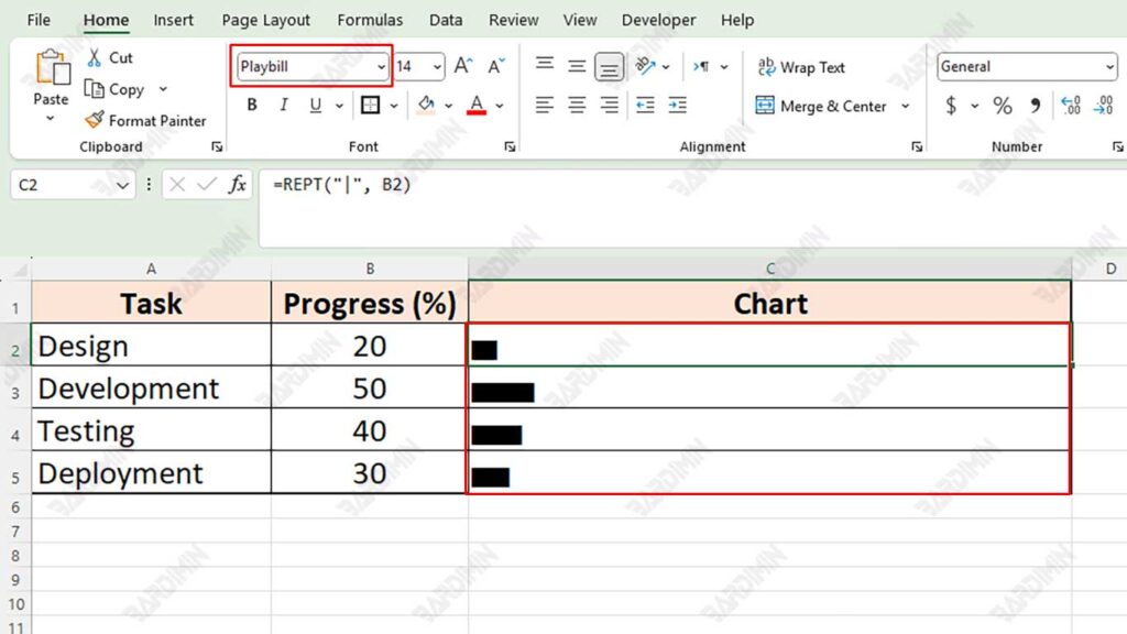
- In cell C2, enter the following formula:
=REPT("|", B2)- Copy the formula to the bottom row (C3 to C5).
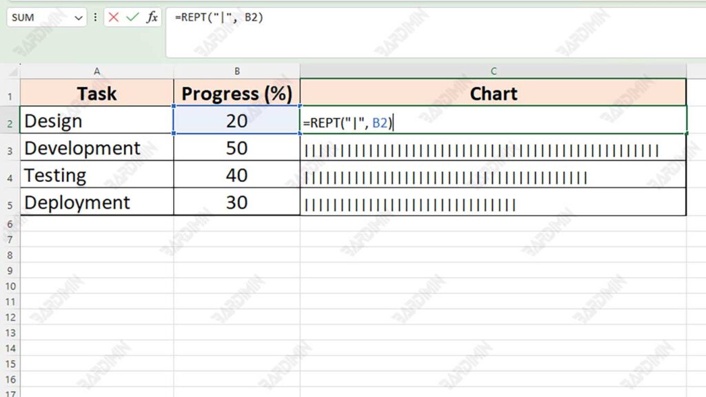
The REPT formula will repeat a specific character; this is what will form a horizontal text graph based on the numerical value in the “Progress (%)” column.
3. Turning Fonts into Playbills
To make this text graphic look more artistic and stand out, change the font of the Chart column to Playbill:
- The column block C2:C5 or all cells contain the REPT result.
- Right-click > select Font.
- Select Playbill from the list of fonts.
- Adjust the font size so that the graphics bar is clear and proportional, such as size 14–20.
- You can also color the text to make it more attractive (e.g., dark blue or dark red).