Have you ever created a chart in Excel and noticed that there is a value of 0 appearing in your chart? Maybe you don’t want to display the value of 0 because it can interfere with the appearance or interpretation of your graph. How to hide the value 0 in an Excel chart?
There are several ways you can hide the value of 0 in an Excel chart, depending on the type of chart and data you use. In this article, I will explain some of those ways with easy-to-follow steps.

Way 1: Using Data Filters
The first way you can use to hide the value 0 in an Excel chart is to use a data filter. Data filters are features that allow you to show or hide specific rows or columns based on the criteria you specify. By using data filters, you can hide rows or columns that contain the value 0 so that they don’t appear in your chart.
Here are the steps to use data filters:
- Select the range of data for which you want to graph. Make sure your data has column headings and there are no blank cells between the data.
- On the Data tab, click Filter in the Sort & Filter group to add the filter to all columns.
- Click the down arrow on the first row of the column containing the value 0 and uncheck 0. Click OK to filter that column, which filters the entire row.
- Create your chart as usual by using a filtered range of data. You can use Insert Chart or the F11 button to create quick charts.
- You’ll notice that your graph doesn’t display a value of 0. Make sure you clear the filter when you’re done.
Way 2: Replace 0 with NA ()
The second way you can use to hide the value 0 in an Excel chart is to replace 0 with NA (). NA() is a function that returns an N/A value, which means it is not available. By replacing 0 with NA (), you can make your graph ignore that value and not display it.
Here are the steps to replace 0 with NA ():
- Select the range of data for which you want to graph. Make sure your data has column headings and there are no blank cells between the data.
- Click Find & Select in the Editing group on the Home tab and select Replace, or type Ctrl + H to open the Find and Replace window.
- Type 0 in the Find what box.
- Type =NA() in the Replace with box.
- Click Options to display additional settings and check Match entire cell contents.
- Click Replace All. Click Close and OK.
- Create your chart as usual by using a range of data that has already been replaced. You can use Insert Chart or the F11 button to create quick charts.
- You’ll notice that your graph doesn’t display a value of 0.
Way 3: Using Graphics Settings
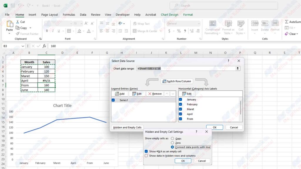
The third way you can use to hide the value 0 in an Excel chart is to use the chart settings. Graphics settings are a feature that lets you change various aspects of your chart, such as titles, legends, axes, labels, colors, and others. Using the chart settings, you can choose how your graph handles the value 0, whether to show it, hide it, or connect it with a line.
Here are the steps to use the chart settings:
- Create your chart as usual by using a range of data that contains a value of 0. You can use Insert Chart or the F11 button to create quick charts.
- Right-click on your chart and select Select Data to open the Select Data Source window.
- In the Select Data Source window, click the Hidden and Empty Cells button in the lower-left corner.
- In the Hidden and Empty Cell Settings window, select one of the following options to specify how your graph handles 0 values:
- Gaps: this option will make your chart not display the value 0 and create a gap between other values.
- Zero: this option will make your chart display the value 0 as usual.
- Connect data points with line: this option will make your graph connect other values with a line and ignore the value 0.
- Click OK to apply the settings you selected. Click OK again to close the Select Data Source window.
- You will see that your graph displays the value 0 according to the option you chose.
Conclusion
In this article, I have described several ways to hide 0 values in an Excel chart, namely:
- Use data filters
- Replace 0 with NA ()
- Use chart settings
You can choose the way that best suits your needs and preferences. Hope this article is helpful and helps you create better Excel charts.


