Pictographs are data formats that use visuals or symbols as a basis for the interpretation of data based on graphic information.
A pictograph is a chart used in statistics to describe data using icons and images relevant to the data. Keys, which determine the meaning of each icon or image, are often included in Pictographs. All pictogram icons must be the same size but can use icon shards to indicate corresponding fractions of the number.
A pictograph, sometimes known as a pictogram, is a graphical representation of data in mathematics that uses images, icons, or symbols. With Pictograph, you can describe the frequency of data by using related symbols or images. Pictographs are one of the most basic methods for describing data.
Advantages of Using Pictographs
Understanding and analyzing data in the form of images will be easier to understand than data presented in the form of numbers.
- It is very easy for children to connect numbers and objects.
- Pictographs make statistical data more interesting, as well as easier to see and understand.
- Very helpful in the visual presentation of statistics.
- Can be used to represent large amounts of data.
- Can be used to express large information.
- Readable.
- No additional explanation is needed.
How to Quickly Create a Pictograph in Excel
A. Create a Dataset
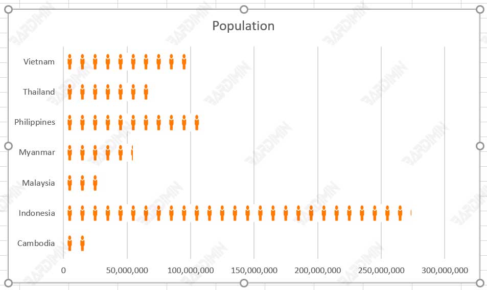
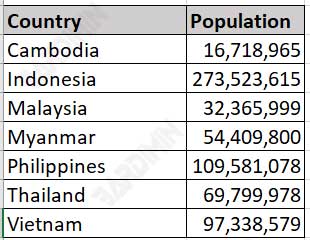
The first thing you have to prepare is a dataset to generate a graph. In this example, Bardimin will use two-column data namely “Country” and “Population”.
B. Create a Chart
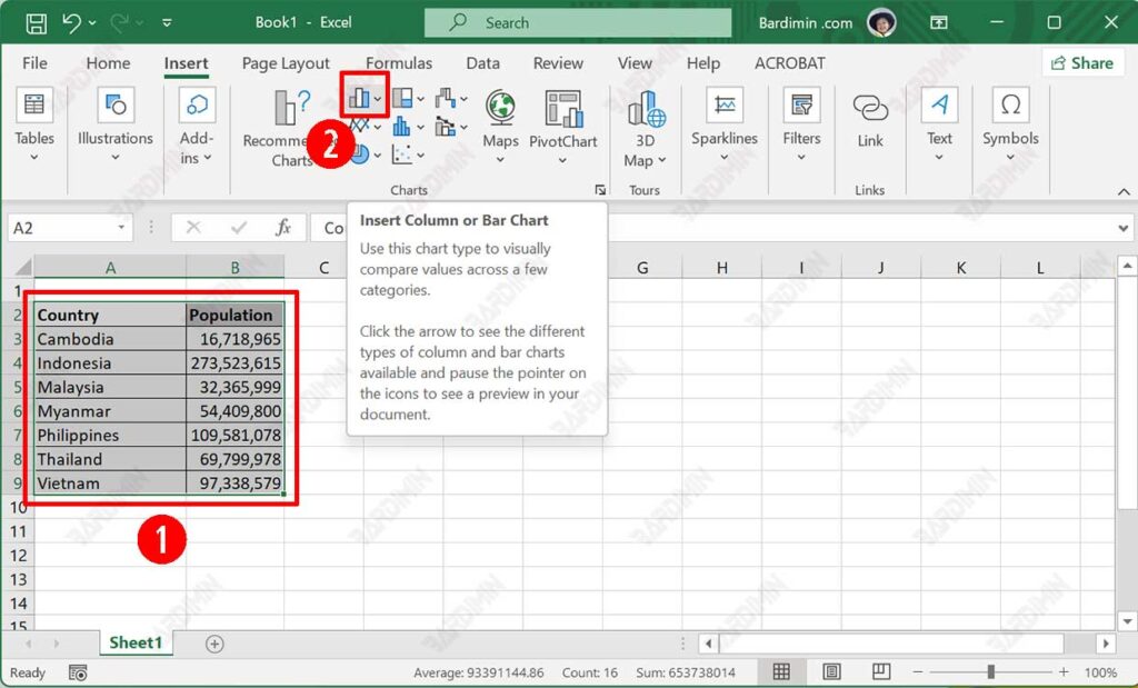
- Select the dataset you created earlier.
- Then navigate to “Insert >> Charts“. Next, click the “Insert Column or Bar Chart” icon.
- Select the type of Chart you want.
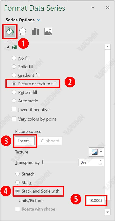
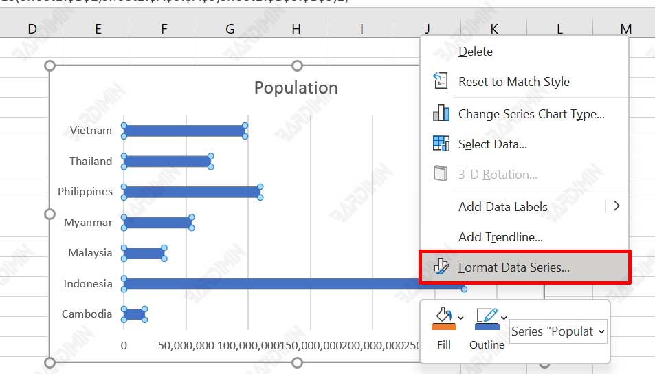
C. Format Data Series
- Select “Bar” by clicking on it.
- Then right-click on the Bar.
- Select the “Format Data Series” option.
- Next on will open the side panel format data series in excel where we can format our data bar according to our usage.
D. Insert Picture in Data Bar
- Select the “Fill & Line” tab in the Format Data Series panel.
- Then select “Picture or texture fill“.
- Next, on the “Picture source“, click the “Insert” button. You can use the images stored on your computer or search for them online.
- Then select “Stack and Scale with“. Under “Units/Picture” fill in the values that will represent each image. In this example, Bardimin specifies each image will represent a population of 10 million.
- If the dataset you are using is not large in value, in step 4, you can select “Stack“.