Counting text frequency in Excel is useful for managing and analyzing data.
Excel is a very popular spreadsheet application and is useful for performing a wide variety of calculations, data analysis, and visualizations. One of the basic functions often used in Excel is the COUNT function.
This function is used to count the number of cells that contain numbers or numeric data. However, what if we want to count the number of cells that contain text or categorical data? Is there any way to calculate text frequency in Excel?
It turns out that there are several ways to calculate text frequency in Excel, both by using formulas and without formulas. In this article, we will discuss some methods we can use to count text frequency in Excel, namely:
- Using the COUNTIF function
- Using the COUNTIFS function
- Use pivot tables
- Use data analysis tools
Using the COUNTIF Function
The COUNTIF function is one of Excel’s simplest and easiest functions to calculate text frequency. This function is used to count the number of cells in a range that meet a certain criterion. These criteria include numbers, text, logical expressions, or cell references.
The syntax of the COUNTIF function is:
=COUNTIF(range, criteria)
Where:
- range is the range of cells that we want to calculate the frequency of
- criteria is the criterion that cells in a range must meet
For example, suppose we have the following data:
| Name | Gender | Age |
| Andi | L | 25 |
| Mind | L | 27 |
| Cici | P | 23 |
| Dedi | L | 29 |
| One | P | 26 |
| Fani | P | 24 |
| Gani | L | 28 |
| Hani | P | 22 |
This data is stored in cells A1:C9. If we want to count the number of males (L) in this data, we can use the following formula:
=COUNTIF(B2:B9,”L”)
This formula will return the value 4 because there are four cells in the range B2:B9 that contain the text “L”. We can write this formula in any cell we want, for example, in cell E2.
If we want to count the number of women (P) in this data, we can use the following formula:
=COUNTIF(B2:B9,”P”)
This formula will return the value 4 as well because there are four cells in the range B2:B9 that contain the text “P”. We can write this formula in cell E3.
If we want to count the number of people aged 25 years in this data, we can use the following formula:
=COUNTIF(C2:C9,25)
This formula will return the value 1 because there is one cell in the range C2:C9 that contains the number 25. We can write this formula in cell E4.
If we want to count the number of people over 25 years old in this data, we can use the following formula:
=COUNTIF(C2:C9,”>25″)
This formula will return the value 6 because there are six cells in the range C2:C9 that contain numbers greater than 25. We can write this formula in cell E5.
By using the COUNTIF function, we can count the frequency of text in Excel easily and quickly. However, this function can only be used to calculate the frequency of text with one criterion. If we want to calculate the frequency of text with more than one criterion, we can use the COUNTIFS function.
Using the COUNTIFS Function
The COUNTIFS function is a function similar to the COUNTIF function but can be used to count the number of cells in one or more ranges that meet one or more criteria. This function is very useful if we want to calculate the frequency of text with more complex or specific conditions.
The syntax of the COUNTIFS function is as follows:
=COUNTIFS(range1, criteria1, [range2], [criteria2], …)
Where:
- range1 is the first range of cells that we want to calculate the frequency of
- criteria1 is the first criterion that cells in the first range must meet
- range2 is the second cell range that we want to calculate the frequency for (optional)
- criteria2 is the second criterion that cells in the second range must meet (optional)
- … is an additional range of cells and criteria that we can add as we need (optional)
For example, suppose we have the same data as before:
| Name | Gender | Age |
| Andi | L | 25 |
| Mind | L | 27 |
| Cici | P | 23 |
| Dedi | L | 29 |
| One | P | 26 |
| Fani | P | 24 |
| Gani | L | 28 |
| Hani | P | 22 |
This data is stored in cells A1:C9. If we want to count the number of males (L) over 25 years old in this data, we can use the following formula:
=COUNTIFS(B2:B9,”L”,C2:C9,”>25″)
This formula will return the value 3 because there are three cells in the range B2:B9 that contain the text “L” and also meet the criterion that those cells must be in the range C2:C9 that contain numbers greater than 25. We can write this formula in cell E6.
If we want to count the number of women (P) between the ages of 23 and 26 in this data, we can use the following formula:
=COUNTIFS(B2:B9,”P”,C2:C9,”>=23″,C2:C9,”<=26″)
This formula will return the value 3 as well, because there are three cells in the range B2:B9 that contain the text “P” and also meet the criterion that those cells must be in the range C2:C9 that contain numbers greater than or equal to 23 and smaller or equal to 26. We can write this formula in cell E7.
By using the COUNTIFS function, we can calculate text frequency in Excel more flexibly and accurately. However, this function still requires us to write the formula manually and adjust the range and criteria as we want. If we want to calculate text frequency in Excel more easily and quickly, without the need to write formulas, we can use a pivot table.
Using Pivot Tables
A pivot table is a very useful feature in Excel to perform data analysis quickly and easily. Pivot tables allow us to rearrange, group, and summarize data from a table or range of data into a new, more informative, and concise tabular form. By using a pivot table, we can count text frequency in Excel with several clicks only.
To use a pivot table, we need to do as following steps:
- Select all the data we want to analyze, including the column headings.
- Click the Insert tab on the ribbon, and then click PivotTable in the Tables group.
- In the Create PivotTable dialog box, select the location where we want to put the pivot table, for example, in a new worksheet or the same worksheet.
- Click OK to create a pivot table.
- On the PivotTable Fields pane, select the column we want to calculate the frequency for, for example, the Gender column, and then drag it to the Rows area.
- On the PivotTable Fields pane, select the same column again, such as the Gender column, and then drag it to the Values area.
- In the Values area, right-click on the column name that appears, for example, Sum of Gender, and then select Value Field Settings.
- In the Value Field Settings dialog box, select the Count option on the Summarize value field by list.
- Click OK to apply the settings.
By doing the above steps, we will get a pivot table displaying the text frequency of our selected column. For example, if we use the same data as before, we would get a pivot table like this:
| Gender | Count of Gender |
| L | 4 |
| P | 4 |
This pivot table shows that there are four males and four females in our data. We can add another column to the Rows or Columns area to create a more detailed pivot table. For example, if we add an Age column to the Columns area, we will get a pivot table like this:
| Gender | 22 | 23 | 24 | 25 | 26 | 27 | 28 | 29 | Grand Total |
| L | 1 | 1 | 1 | 1 | 4 | ||||
| P | 1 | 1 | 1 | 1 | 4 | ||||
| Grand Total | 1 | 1 | 1 | 1 | 1 | 1 | 1 | 1 | 8 |
This pivot table shows that there is one person who is 22 years old, one person who is 23 years old, and so on. We can also look at the distribution of sexes by age. For example, out of four people over four over 25 years old, three of them are men and one of them is women.
By using a pivot table, we can calculate text frequency in Excel very easily and quickly, without the need to write formulas. We can also customize the appearance and settings of the pivot table according to our needs. However, pivot tables may not be suitable for all types of data or analysis. If we want to calculate text frequency in Excel more sophisticatedly and professionally, we can use data analysis tools.
Using Data Analysis Tools
Data analysis tools are additional features that we can enable in Excel to perform further and in-depth data analysis. Data analysis tools provide a variety of tools that we can use to perform various types of analysis, such as regression analysis, variance analysis, hypothesis testing, and others. One of the tools we can use to calculate text frequency in Excel is the Histogram tool.
A Histogram tool is a tool used to create a histogram, which is a bar graph that shows the frequency distribution of data. Histograms can be used to see how often a value or category appears in a piece of data. By using the Histogram tool, we can calculate the frequency of text in Excel more visually and attractively.
To use the Histogram tool, we need to perform the following steps:
- Make sure the data analysis tools feature is enabled in Excel. If not, we can activate it by clicking the File tab on the ribbon, and then clicking Options. In the Excel Options dialog box, select the Add-Ins category. In the Manage list, select Excel Add-Ins, and then click Go. In the Add-Ins dialog box, check the Analysis ToolPak option, and then click OK.
- Select all the data we want to analyze, including the column headings.
- Click the Data tab on the ribbon, and then click Data Analysis in the Analysis group.
- In the Data Analysis dialog box, select the Histogram option, and then click OK.
- In the Histogram dialog box, enter the range of data that we want to calculate the frequency for in the Input Range box, for example, A1:C9.
- Enter the range of cells containing the categories we want to calculate the frequency for in the Bin Range box, for example D1:D2. This category must match the type of data present in the column for which we want to calculate frequency, for example, “L” and “P” for the Gender column.
- Select the location where we want to put the histogram results, for example in a new worksheet or the same worksheet.
- Check the Chart Output option if we want to create a histogram chart in addition to the histogram table.
- Click OK to create a histogram.
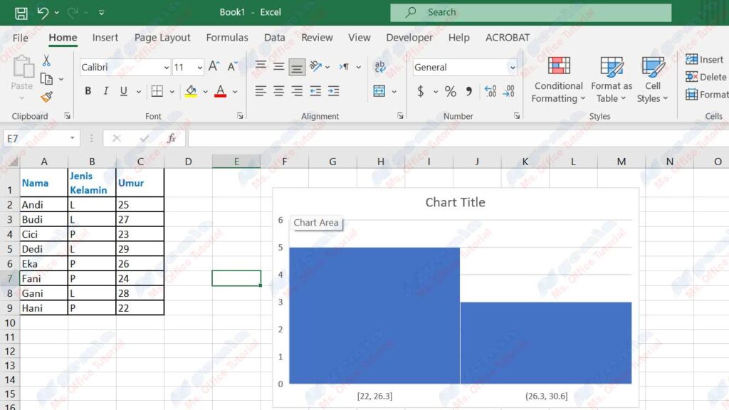
By doing the above steps, we will get a histogram table and a histogram graph displaying the text frequency of our selected column. For example, if we use the same data as before, and we want to calculate the text frequency of the Gender column, we would get a histogram table and a histogram graph like this:
| Gender | Frequency |
| L | 4 |
| P | 4 |
| More | 0 |
This histogram table and histogram graph show that there are four males and four females in our data. We can change the appearance and settings of the histogram table and histogram chart to our liking.
By using the Histogram tool, we can calculate the frequency of text in Excel more visually and attractively. We can also perform more sophisticated and professional data analysis by using other data analysis tools.
Conclusion
In this article, we have discussed several ways to count text frequency in Excel, namely:
- Using the COUNTIF function
- Using the COUNTIFS function
- Use pivot tables
- Use data analysis tools
Each method has its advantages and disadvantages, depending on the type of data, the purpose of analysis, and our preferences. We can choose the most suitable way to suit our needs to calculate text frequency in Excel easily and accurately.
Thank you for reading this article to the end. See you in the next article!