An organizational chart is one of the most important visual tools in managing the structure of a company, institution, or project. An organization chart lets you easily see the hierarchy, responsibilities, and reporting relationships between team members. This helps improve internal communication and ensures that everyone understands their role and position in the organization. A clear and structured organizational chart can be the key to higher efficiency and productivity.
However, creating organizational charts manually can be time-consuming and prone to errors. This is where Google Sheets comes in as a practical and efficient solution. With its advanced features, Google Sheets allows you to create organizational charts that are dynamic, easily updated, and customizable to your needs.
In this article, Bardimin will guide you step by step to create an org chart in Google Sheets. Starting from preparing data, using the Chart feature, to adjusting the appearance of the chart to look professional. Let’s see the full guide!
Step 1: Prepare Your Data
Before creating an org chart in Google Sheets, an important first step is to make sure your data is organized. Well-structured data will make charting easier and produce precise and informative visualizations.
Here’s an example of the data structure required to create an org chart:
| Name | Position | Direct Supervisor |
| John Doe | CEO | – |
| Jane Smith | Marketing Manager | John Doe |
| Michael Brown | Production Manager | John Doe |
| Anna Lee | Marketing Staff | Jane Smith |
| David Wilson | Production Staff | Michael Brown |
With the data already prepared, you’re ready to move on to the next step, which is to enter the data into Google Sheets and create an org chart. Make sure your data is complete and accurate for optimal results!
Step 2: Open Google Sheets and Enter Data
Once your data is ready, the next step is to open Google Sheets and enter the data into a worksheet. Here is the full guide:
1. Open [Google Sheets](https://sheets.google.com)
- If you’re not already signed in, please sign in to your Google account.
- After logging in, click the “Blank” button to create a new worksheet.
2. Create a New Worksheet
- After opening Google Sheets, you will see the main interface.
- Click the “+” icon or select “Blank Spreadsheet” to start a new worksheet.
- Name your worksheet by clicking at the top (for example, “Company Org Chart”).
3. Enter Data into the Appropriate Columns
In the first row, create a column header by typing:
- Column A: “Name”
- Column B: “Job Title”
- Column C: “Direct Supervisor”
Starting from the second row, enter the data you have prepared beforehand.
Step 3: Use the Chart Feature to Create an Organizational Chart
Once your data has been entered into Google Sheets, the next step is to use the Chart feature to create an org chart. Here’s the full guide:
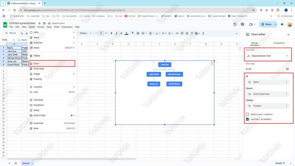
1. Block Data You’ve Entered
- Highlight or block all the data you’ve entered, including the column headers. Make sure all columns (Name, Job Title, Direct Supervisor) are blocked.
- Example: Block from cells A1 to C6 (adjust to your amount of data).
2. Click Insert > Chart
- Once the data is blocked, click the Insert menu at the top of the screen.
- Select the Chart option from the dropdown menu. This will open the Chart Editor panel on the right side of the screen.
3. On the Chart Editor Panel, Select Org Chart from the Available Chart Types
- In the Chart Editor panel, you’ll see different types of charts available, such as Bar Charts, Pie Charts, Line Charts, and more.
- Scroll down or look for the Org Chart option.
- Select Org Chart as the type of chart you want to create.
4. Customize the Chart Display
Once the org chart appears, you can customize its appearance to make it more informative and engaging.
