Method 3: Using “Insert Objects” for More Flexible Integration
The third method to combine charts from Excel to PowerPoint is to take advantage of the “Insert Object” feature. With this method, you get more flexibility in inserting charts, allowing you to add charts as editable objects directly in PowerPoint.
The “Insert Object” feature allows you to add different types of objects to your PowerPoint slides, including charts from Excel. This way, the chart will be inserted as an integrated Excel object, so you can edit the data directly from PowerPoint without having to go back to Excel.
Advantages of using this method:
- Interactivity: Charts inserted as objects can be edited directly, allowing you to change the data without opening the Excel file.
- Dynamic Data Presentation: You can create interactive charts that can adapt to changes in data.
- Design Consistency: Using objects helps keep the presentation design consistent and professional.
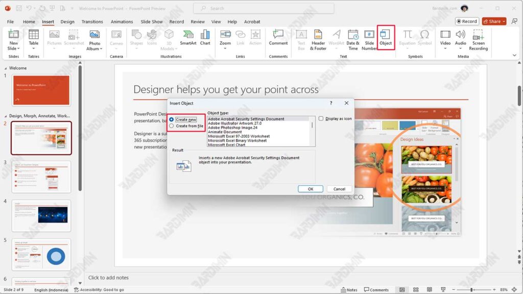
Steps to Use “Insert Object”
- Start by opening the PowerPoint app and selecting the slide where you want to insert the chart.
- In the top menu, click on the “Insert” tab.
- Click on the “Object” icon in the text group.
- Select “Create from File” or “Create New”:
- If you select “Create New”, select “Microsoft Excel Chart” and click OK.
- If you choose “Create from File,” find the Excel file that contains the graph you want to insert and check the “Link” option if you want to connect the data.
- Once the chart is inserted, you can double-click on the chart to open Excel and edit the data directly.
If you want to add an interactive graphic about product sales, you can take advantage of the “Insert Object” feature. This way, you can create a bar chart that depicts sales trends each month. When the audience clicks on those graphs during the presentation, they will be able to see more in-depth information or even make changes to the data directly, creating a more engaging and informative experience.
Comparing the Three Methods
To help you choose the most suitable method for integrating charts from Excel to PowerPoint, here is a comparison table that summarizes the advantages and disadvantages of the three methods discussed.
| Method | Excess | Deficiency |
| Copy and Paste | Easy and quick to use. | There are no automatic updates; need to re-copy if the data changes. |
| Suitable for one-off presentations without further data changes. | The graphic format may not always be preserved when moved. | |
| Using the “Link” option | Automatic updates when data in Excel changes. | It requires a connection to an Excel file; if the file is moved, the link can be corrupted. |
| Maintain data consistency between Excel and PowerPoint. | It may take more knowledge to set up properly. | |
| Using “Insert Object” | Charts can be edited directly in PowerPoint without opening Excel. | Requires more steps to insert than other methods. |
| Create interactive graphics that can be changed during presentations. | The size of the presentation file can be larger because it stores Excel objects. |
Conclusion
Each method has advantages and disadvantages that need to be considered according to your presentation needs. Therefore, it is important to evaluate the context and purpose of your presentation before choosing the most appropriate method.
We invite you to try each of these methods and find which one is most effective for improving the quality of your presentation. With a good understanding of how to integrate graphics, you can present information in a more engaging and informative way, as well as increase audience engagement during presentations.
