Are you bored with the rigid, cluttered, and unnecessarily hierarchical look of Excel Pivot Tables? Whenever you have to present data to a client or boss, you spend hours just tidying up the format, even though the analysis is done. This is a common problem for Excel users: wanting the speed of a Pivot Table, but also wanting the neatness of a regular table.
Microsoft has provided a clever solution called Report Layout, a hidden feature that can turn the look of the Pivot Table into a flatter and more professional one in just three clicks. Unlike the Convert to Range option that eliminates dynamic functionality, this technique retains all the advantages of the Pivot Table while providing design freedom like manual tables.
In this exclusive guide, we’ll reveal how to enable Tabular Form and Repeat All Item Labels to eliminate ‘tiered’ views, management consultant-style professional formatting tricks, and fatal mistakes that can make your reports look worse when using Report Layout. Are you ready to change your Excel report from ‘regular’ to ‘stunning’ with no extra work?
Why is Report Layout the Best Solution?
In the professional world, especially when compiling business reports or presenting data to management, the default view of Pivot Table often presents visual challenges. This is what makes the Report Layout feature a very viable solution.
A Classic Annoying Problem: Pivot Tables Are Too Storied
By default, Pivot Table displays data in a Compact Form format, where multiple fields are joined in a single column, making the view “tiered”. Some of the problems that often arise are:
- Difficult to understand by audiences without a technical background
- Not ideal for inclusion in a formal report
- Complicating the process of filtering or merging with other tables
Advantages of Using Report Layout
The Report Layout feature, especially in Tabular Form mode, offers several advantages that make it the best choice:
1. Maintain Dynamic Update Capability
Unlike the Convert to Range or Copy-Paste Values method, the use of Report Layout still keeps the data active. When the data source changes, the Pivot Table can be refreshed automatically.
2. Compatible with All Excel Versions
Report Layout features are available from Microsoft Excel 2010 to the latest version (2023), making them a safe and consistent choice in various work environments.
3. More Flexible for White Papers
With the Tabular Form and Repeat All Item Labels options, tables are neatly arranged row by row, similar to regular tables, which are much more suitable for financial reports, sales recaps, or data audits.
4. Doesn’t Sacrifice Functionality
You can still use filters, slicers, or calculated fields like the ones in a regular Pivot Table.
“90% of Excel users don’t realize this feature is in the Design ribbon, even though it’s the most elegant solution to the Pivot Table formatting problem.”
Step 1: Enable the Report Layout Feature in the Pivot Table
For the Pivot Table view to resemble a regular table, you need to change its default structure using the Report Layout feature available in the Pivot Table design tab.
Follow these steps to change the Pivot Table view to tabular format:
- Click on any area within your Pivot Table.
- Go to the Design tab (in the Indonesian version of Excel, it’s usually called Desain).
- Click the Report Layout dropdown.
- Select the Show in Tabular Form option
This will display each field in a separate column, as in a normal table structure.
- Click Report Layout again, and then select Repeat All Item Labels
This feature will automatically populate empty cells with labels from the previous row, making the table whole and easy to filter.
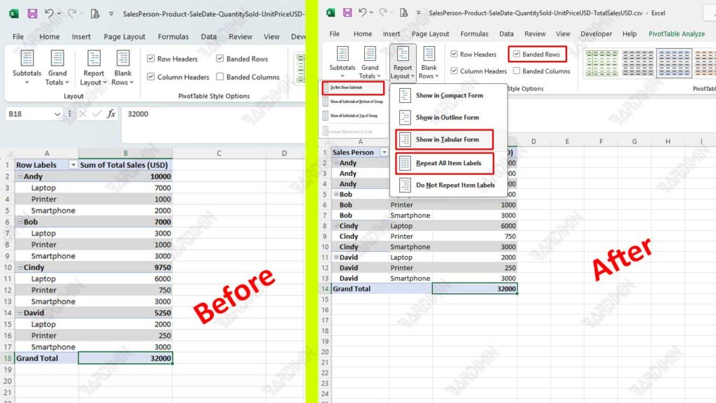
To make your table look cleaner and focus only on the main data, also enable the features:
- Do Not Show Subtotals
By eliminating subtotals, the view becomes minimalist and is perfect for report purposes that require a clean and aligned format.
- Banded Rows
This feature adds alternating shading for easy line reading!
Step 2: Optimize Pivot Table Formatting
After setting up the Pivot Table view with Report Layout, the next step is to make sure the visual format of the table looks professional, neat, and easy to read. Formatting is not just about aesthetics; a good display will speed up the understanding of the data and reinforce the message in the report.
To make the Pivot Table look like a regular professional table, follow these design practices:
1. Add a Border
- Select the entire area Pivot Table
- Press Ctrl + 1 to open the Format Cells dialog box
- Navigate to the Border tab
- Add horizontal and vertical lines across data areas
- Use thin lines for a minimalist and neat feel
2. Adjust the Alignment (Text Alignment)
- Align left for columns of text, such as categories or names
- Right-align for a number column, such as total sales or quantity
- Use the Align Left and Align Right features in the Home Excel tab
3. Enable Banded Rows
- Still inside the Design tab, check the Banded Rows option
- This will provide a striped row color intermittent effect that improves the readability of the data, especially on large tables
“Consistent formatting will increase your credibility as a data analyst. Many reports are rejected or revised not because of incorrect data, but because of a confusing or unreadable display.”
Step 3: Combine with Other Features for Maximum Results
After successfully changing the Pivot Table view to resemble a regular table with Report Layout and optimizing its formatting, it’s time to improve the functionality and interactivity of your tables with a combination of additional features from Excel.
This combination not only enriches the user experience but also strengthens the ability to analyze data in real-time without sacrificing the aesthetics of the display.
1. Conditional Formatting
- Use the Conditional Formatting feature from the Home tab
- Apply rules such as: Greater Than to mark sales above the target, Color Scales to indicate the intensity of the value
- Result? Your pivot table is not only informative, but also visually communicative
2. Slicer
Slicer is one of the favorite features of data professionals because it provides interactive filtering capabilities with a clean and easy-to-use interface.
How to Add a Slicer:
- Click on the Pivot Table area
- Go to the PivotTable Analyze tab → Click Insert Slicer
- Select a field such as Region, Month, or Category
- Place the slicer next to the Pivot Table, and use it to filter the view of the data with a single click
By taking advantage of Report Layout, Banded Rows, and additional features like Conditional Formatting and Slicer, you’ve transformed a rigid Pivot Table into a dynamic and elegant table without losing its basic functionality.